

You are a CEO or COO who is spending more on tech and getting less clarity in board meetings. You walk in with thick packets, scattered reports, and charts that even your head of IT struggles to explain. The board asks simple questions about cyber risk, AI use, and tech spend, and the room gets tense. The goal is to provide a professional presentation, moving away from scattered reports.
Your problem is not the tools. It is the story. A board-ready dashboard is not about prettier charts, it is about a simple, credible view of cost, risk, and value.
Your strategic partners at CTO Input play the role of a seasoned, neutral guide on your side of the table. The job is to translate complex technology data into clear business Decision-Making your board can stand behind.
The rest of this article walks through seven practical board technology dashboard best practices. You will see what to include, what to drop, and how to show trends in a way your board can act on.
Start With the Board’s Questions, Not Your Tech Stack
A board-ready dashboard starts with what the board must decide, ensuring strong Strategic Alignment, not with a list of systems and tools. Think in terms of growth, margins, risk, resilience, and AI use.
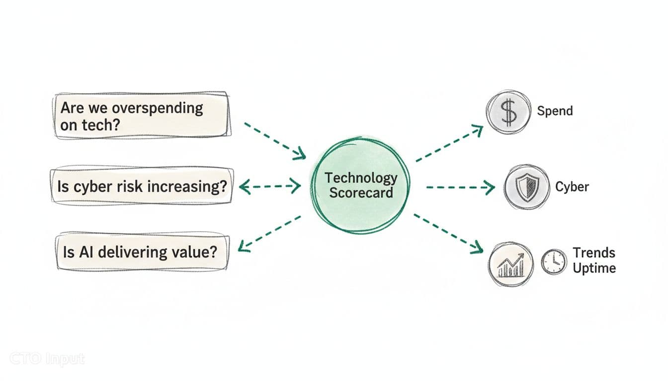
Start by writing five to seven core questions on a single page, such as:
- Are we overspending on technology for our size and growth rate, considering Total Cost of Ownership (TCO)?
- Is cyber risk going up or down quarter by quarter?
- Is AI-Driven Reporting helping productivity, or adding hidden risk and cost?
- Are major tech projects landing on time and on budget?
- Can we keep serving customers if a key system fails?
This list becomes the script for your dashboard.
You can see a similar approach in this guide to KPI dashboards framed around questions. The questions lead, the metrics follow.
Turn board concerns into 5 to 7 clear technology outcomes
Translate those questions into clear outcomes the board can track over time using Key Performance Indicators (KPIs). For most mid-market companies, the list looks like:
- System uptime for the core customer platform, including ERP Integration
- Delivery status for 3 to 5 key projects
- Cyber maturity score and number of open high-risk items
- Tech spend as a percent of revenue, providing critical Financial Data for Finance Teams and Leaders
- Time to recover from the last major incident
This list of outcomes helps reduce Manual Reporting Overhead by supporting automated data gathering through Automation. Drop vanity metrics that do not tie to these outcomes. Number of tickets closed, page views, or server counts rarely help the board make a decision.
A fractional CTO-style partner like CTO Input often builds a simple technology scorecard from these outcomes, such as Performance Dashboard Examples, in a few working sessions using tools like Tableau and Power BI. That scorecard then anchors every future board pack.
Align each metric to a decision the board actually makes
Every chart should answer one question: “So what should we decide or approve?” These decision points require thorough Risk Assessment, and this process supports Strategic Alignment.
A few examples:
- A chart of tech spend as a percent of revenue over eight quarters supports a decision on Resource Allocation to increase, hold, or cut next year’s tech budget, backed by a solid Business Case.
- A line chart of cyber risk score versus target supports a decision on whether to fund a new security initiative now or later.
- A project delivery chart for three strategic programs supports a decision to re-sequence work or add capacity.
Clear data from these charts facilitates faster Close Acceleration for Board Members. If a chart does not help a funding, risk, or sequencing decision, it belongs in an appendix or not at all.
You can find more ideas on clear dashboard design in this overview of BI dashboard design principles and best practices.
Design a Simple, Visual Dashboard That Boards Can Read in Five Minutes
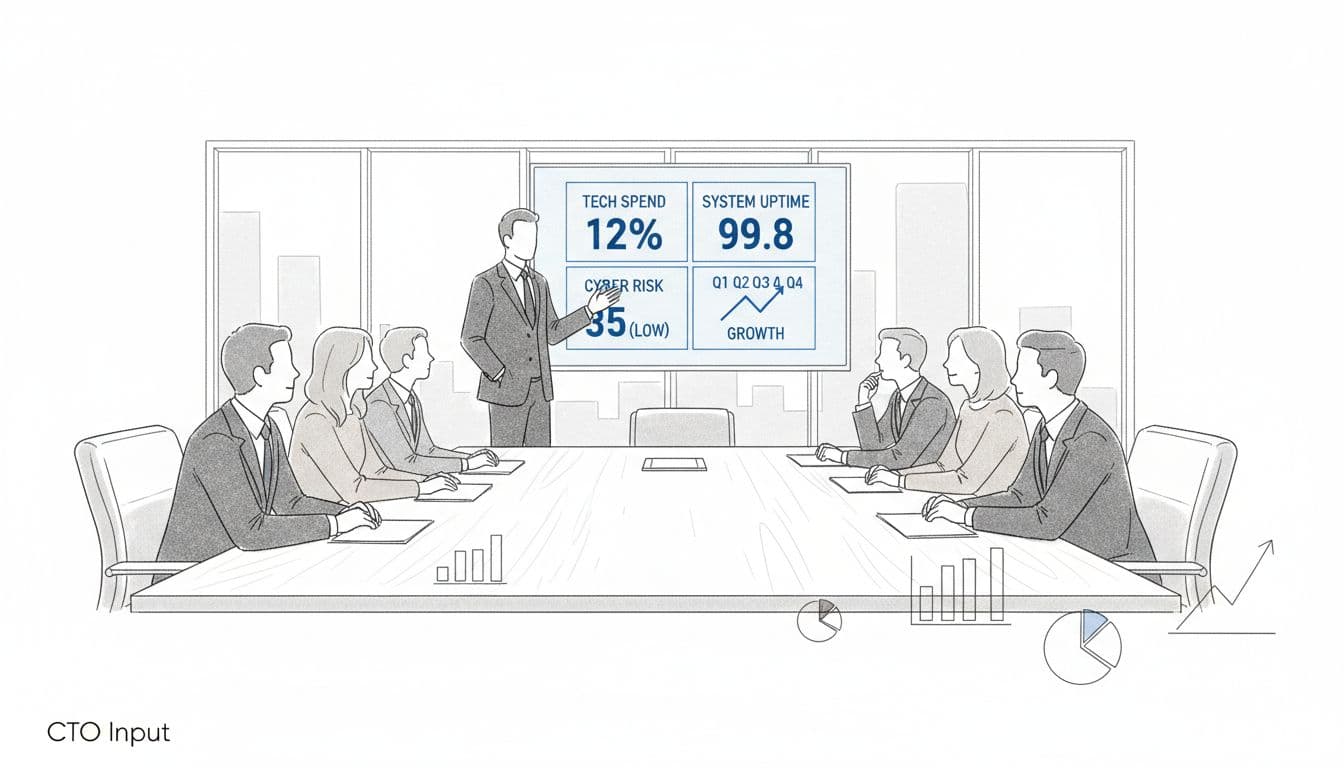
Once you know the questions and outcomes, the next step is design. Board-Ready Reporting best practices all point in the same direction: keep it simple, visual, and consistent so a non-technical board member can scan it in five minutes and still feel confident.
Keep the layout clean and create effective Visual Dashboards
The main view should fit on a single page, whether it is a slide or a web view. Aim for 8 to 10 tiles at most, these Performance Dashboard Examples each with:
- A large, readable number
- A short label the board understands
- A simple trend or color indicator
Visual Dashboards avoid dense tables on the front page. Details can live in an appendix or deeper drill-downs, but the top view should feel like the cockpit of a plane, not a raw database. This layout provides a Professional Presentation that leaders can grasp quickly.
Research on effective dashboard design backs this up. When leaders see too many numbers at once, they stop asking good questions and start guessing.
Design the page so it reads well on a laptop and on a tablet in portrait mode. Many Board Members now read packs on iPads.
Use plain language, familiar charts, and consistent colors
Avoid strange chart types. Stick with:
- Line charts for trends
- Bar charts for comparisons
- Simple scorecards for single numbers
Tools like Tableau and Power BI enable sophisticated visualization. Use plain labels. “Unplanned downtime” beats “Severity 1 incidents.” “Cyber risk score vs target” beats “Security posture index.”
Pick a simple color code and keep it the same from meeting to meeting as part of a standardized Operating Model: green in range, yellow at risk, red out of tolerance. When a board member sees a red tile, they should know, almost in their gut, that they must ask why.
You can see this idea in action in many board reporting best practice guides, where consistency over time matters more than fancy visuals.
Show trends, not snapshots, so the board can see direction
Boards care more about direction and speed than raw numbers. A single data point is noise. A trend is a story. Board-Ready Reporting delivers this through clear visuals that speed up the reporting cycle, facilitating Close Acceleration.
For each key metric, show at least four to eight quarters of history. Where it helps, add:
- A thin line for the target or risk tolerance
- A simple forecast for the next two or three quarters
These elements provide Forward-Looking Insights. Examples:
- Cyber risk score over eight quarters with a target line, enhanced by AI-Driven Reporting, tells the board if you are closing the gap.
- System uptime trend for the main platform, including ERP Integration, shows if recent investments are improving Operational Efficiency.
- Tech spend as a percent of revenue with a next-year forecast helps position a budget request.
This structure also makes your life easier. Over time, you spend less time defending one number and more time explaining how you are bending the curves in the right direction. It reduces Manual Reporting Overhead through improved data Automation for trend updates.
Use Data, Context, and Risk to Tell a Trustworthy Story
Superior Data Quality goes beyond a clean layout. The board has to trust the numbers, understand why they move, and see that sensitive data is handled with care.
Pair every key number with a short explanation and benchmark
Never drop a number on the board without context. Under each chart or tile, add a one-line takeaway that provides Narrative Context by answering one of two questions:
- Why did this move?
- How do we compare?
For example:
- “Unplanned downtime improved from 99.5% to 99.8% after database upgrade in Q2.”
- “Tech spend is at 5.2% of revenue, in line with peers at 5–7%.”
- “AI-supported processes now cover 40% of customer support tickets, with no increase in complaints.”
Benchmarks can come from industry averages, internal targets, or last year’s numbers. Resources like this guide to KPI dashboards show how clear framing turns raw data into judgment.
Keep the commentary tight. A board should be able to read the chart, skim the line, and understand the point in seconds.
Keep data fresh, stable, and sourced from a single version of truth
Nothing kills trust faster than numbers that change between meetings or disagree with finance. Reliable Data Integration and Sources ensure alignment through a single data pipeline or “system of record,” often involving ERP Integration for core data. Financial Data should align with the CFO’s reports through close collaboration with Finance Teams and Leaders, project data with the PMO, and risk data with your security log source.
Real-time feeds are less important than:
- A clear refresh cycle (for example, updated monthly or before each board pack)
- Stable definitions for each metric, supported by Governance and Controls and Audit and Auditability for traceable sources
- A short data dictionary in the appendix
Strong Data Quality and Governance and Controls underpin these data management principles. When a board member asks, “Why is this number different from last quarter’s pack?” you should have a calm, simple answer.
You can borrow design ideas from general dashboard design best practices or tools like Tableau and Power BI, but marry them to strong data governance.
Surface cyber, AI, and resilience risk without fear-led drama
You do not need a 40-page security report. Most boards want three to four simple risk indicators presented in calm, factual language, for example:
- Number of open high-severity vulnerabilities older than 30 days
- Results of the most recent phishing test or training cycle
- Number of critical processes that now depend on AI-Driven Reporting or third-party models, tracked with Audit and Auditability
- Time to recover from the last major outage versus your target
Use the same color logic as the rest of the dashboard. Green, yellow, red against a clear tolerance range.
The goal is not to scare people. The goal is to show whether Risk Assessment is inside or outside the line the board already agreed to, and what management is doing next, following a consistent Operating Model.
You can see the same pattern in many board reporting and portal tools. The best ones support robust data Automation to accelerate reporting cycles and promote Close Acceleration, showing risk in business terms, not technical drama.
Conclusion: A Board That Nods Instead of Squints
When you put these seven ideas together for Strategic Alignment with your goals, you get a different kind of conversation. You start from the board’s questions, keep the layout and language simple, show trends instead of snapshots, add context and benchmarks, protect your data, and keep cyber, AI, and resilience risk visible but calm.
Imagine your next board meeting. One page up on the screen. Clear tiles of Key Performance Indicators (KPIs). Short notes. The board nods instead of squints. Questions get sharper, but fewer. Decisions on tech spend and risk move faster because improved reporting ensures Financial Transparency and the story is clear.
You do not need a full-time CIO or CISO to reach that point. You need a better design, a single source of truth, and a guide who can translate complexity into a simple, believable plan where clearer communication facilitates faster Decision-Making.
If you want more practical guidance, explore the articles on the CTO Input blog at https://blog.ctoinput.com. When you are ready for a low-friction next step, you can learn more or request a short diagnostic call through https://www.ctoinput.com.