
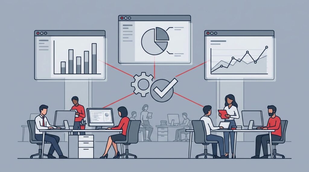
Your executive dashboards can all look polished and still tell three different stories. That is when leadership starts spending more time debating numbers than making data-driven decisions.
The problem is usually not one bad report. It is mismatched definitions, messy ownership, stale data, and too many systems pretending to be the source of truth.
When the numbers stop lining up, trust goes with them. Here is how to get it back.
Key takeaways
- Dashboards disagree because different departments often apply unique definitions to the same key performance indicators.
- A trustworthy dashboard provides visibility into outcomes, owners, and decision points rather than just tracking surface level performance metrics.
- Restoring trust requires cleaner data, clearer governance, and a tighter reporting rhythm across the organization.
Why executive dashboards disagree in the first place
Most dashboard problems start with definition drift across your various data sources. Finance defines revenue one way, while Sales pulls their figures from the CRM. Meanwhile, operations may be looking at bookings, billings, or active users and calling them all growth.
That sounds small until you are in a meeting with three versions of the same number.
Then timing gets in the way. One dashboard relies on real-time data, while another updates only after month-end close. A third depends on a manual export that someone remembers to send on Friday afternoon. None of that looks dramatic on its own, but together, it creates a mess.
Tool sprawl makes it worse. Shadow IT, old spreadsheets, and half-retired systems keep their own versions of the truth. Technical debt adds more drag, and so does a weak systems inventory. If nobody can name where the number starts, nobody can defend where it ends.
This is why technology governance matters. A dashboard only works when it sits inside a clear technology strategy operating rhythm. Without that, every team builds its own version of reality and calls it reporting.
What happens when leaders stop trusting the numbers
Once trust drops, the damage spreads fast. Meetings get longer. The entire decision-making process slows down. People stop arguing about the business and start arguing about screenshots.
If you need three meetings to decide which number is right, the dashboard is already failing you.
You also see side spreadsheets pop up. Leaders start keeping private files because the official dashboard no longer feels safe to use. That creates even more drift, because now the business has two systems, the formal one and the unofficial one.
The cost shows up in tech spending too. If you cannot trust the numbers, you cannot defend technology spend optimization, technology ROI, or tech spending ROI with much confidence. IT cost reduction turns into guesswork. Cost per outcome reporting becomes impossible because the outcome itself, whether it involves revenue growth or a shrinking profit margin, is too fuzzy to track accurately.
Boards feel this quickly. They do not need perfect data. They need board-ready reporting they can act on. If your board pack still leaves them asking, “Which number is right?” the report is not board-ready yet. A stronger model is outlined in board-ready technology reporting, where the point is not activity, but decision support.
And when the dashboard covers risk, the stakes rise again. Weak executive dashboards can hide cyber exposure, vendor issues, or a growing technology leadership gap until somebody asks a hard question. Then everyone scrambles.
What a trustworthy executive dashboard actually looks like
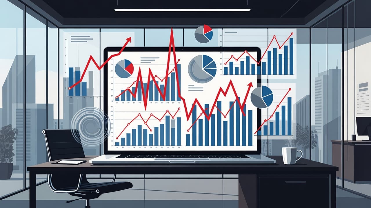
A good dashboard is not just about fancy data visualization or packing in more charts. It is built around fewer numbers, cleaner definitions, and clear ownership.
| Bad dashboard behavior | What it usually means | Better version |
|---|---|---|
| Same metric, different answers | No shared definition | One agreed formula, one owner |
| Fresh data next to stale data | No clear refresh cadence | Visible update times and cutoffs |
| Too many charts, no decision | Activity without focus | Outcome-based reporting |
| Different teams have different versions | Weak data governance | One source of truth |
That is the difference between a dashboard that informs and one that confuses. You are not trying to impress anyone with volume. You are trying to make the next decision obvious by using interactive dashboards that allow for deeper exploration.
A strong dashboard also connects to your business technology strategy. Whether you are building a high-level strategic dashboard for long-term planning, a focused CEO dashboard for core performance indicators, or specialized views like a CFO dashboard or CMO dashboard, the data must align with your goals. Furthermore, an operational dashboard often requires real-time data to track whether the technology roadmap is on track, whether the board-ready tech roadmap still matches the plan, and whether the company’s technology priorities for growing companies are being reflected in day-to-day work.
If you need a simpler benchmark, start with a one-page technology strategy. If the strategy cannot fit on one page, the dashboard will drift. If the dashboard cannot map back to the strategy, it is just reporting activity.
How to restore trust in the numbers
Start with one business question. Not ten. Pick the one that matters most right now. Whether you are tracking key performance indicators for growth, cash flow, or leading indicators of potential risk, your dashboard should answer that primary question first.
Then define each metric in plain English. Write down what counts, what does not count, and where the data comes from. This is where data quality, data governance, and information governance stop being abstract concepts and start being useful.
Next, trace ownership. Every number needs a named owner, a designated system of record, and a clear decision rule. This is where a decision rights map helps. By mapping your data sources and implementing drill-down capabilities, you provide the transparency needed to verify the numbers. If nobody can approve changes to a metric, the metric is not stable.
Then set a reporting rhythm. Weekly for operating issues. Monthly for performance. Quarterly for board discussion. That is your technology operating rhythm. It keeps the dashboard tied to real decisions instead of random updates.
If the dashboard touches cyber, it should feed board cybersecurity reporting and cyber risk reporting to the board. If it touches vendors, bring in third-party risk management, vendor risk management, and vendor due diligence. If it touches customer or employee data, the reporting should sit inside a real data governance framework and technology risk management framework.
When the problem is ownership, not software, fractional CTO leadership services can help you reset the operating picture without waiting for a full-time hire.
If the question is broader, use Get an Executive Technology Clarity Check to sort out whether the issue is reporting, ownership, data, or a deeper technology leadership gap.
The leadership problem behind the dashboard problem
Sometimes the executive dashboard is not the root issue. It is merely a symptom.
If your numbers keep disagreeing after the definitions are cleaned up, you may have a technology governance for CEOs problem or a technology governance for boards problem. In plain language, nobody has drawn clear lines around who owns the truth within the decision-making process.
That shows up in founder-led technology decisions, COO technology strategy, and weak executive technology leadership. It also shows up when the business has a fractional CTO, interim CTO, virtual CTO, or part-time CTO only in name, but not in real decision authority. The title does not matter much if the ownership is still fuzzy.
This is also where a technology assessment or technology audit helps more than another dashboard tool. A good review will show you whether the issue sits in process, data, systems, or leadership. A comprehensive assessment should evaluate your success metrics and productivity metrics to see if they align with company goals. If cyber is part of the picture, add a cybersecurity risk assessment and an IT security assessment. If the business is growing fast, look at the 12-month technology roadmap and see whether the reporting still matches reality.
That is the point where a fractional CIO, fractional CISO, virtual CISO, or interim CISO may also matter, depending on where the breakdown sits. The title is less important than the fix. You need someone who can tie the numbers to the business, not just to the tool.
FAQ
Why do finance, operations, and sales show different numbers?
Because they are often answering different questions. Finance teams frequently rely on analytical dashboards to track long-term trends, while sales departments lean on tactical dashboards to monitor daily pipeline health. One team may be using booked revenue, another invoiced revenue, and another forecasted revenue. The fix is not more charts. It is one shared definition for the decision in front of you.
Should the board get the same dashboard as management?
Not usually. The board needs a cleaner view, not a busier one. They need board-ready reporting that avoids cluttered data visualization and instead focuses on what changed, why it matters, and what decision is needed next. While management might benefit from constant access to real-time data, the board is better served by high-level insights.
What should I fix first, data, software, or ownership?
Start with ownership. If nobody owns the performance metrics, the data will keep drifting. After that, refine your decision-making process by cleaning the definitions and then checking the systems feeding the numbers.
Conclusion
Your executive dashboards do not have to be perfect to be effective. They do have to agree on the basics, however. If they do not, the business ends up paying for confusion twice: once in wasted time and again in poor decision-making.
The fix is usually simpler than it looks. It requires clean definitions, clear owners, and one reporting rhythm. Ultimately, success comes down to better alignment between your metrics and the data-driven decisions they are supposed to support.
When the dashboard still feels unstable, the issue is rarely the chart itself. It is the operating model underneath it.